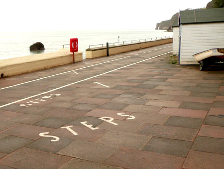
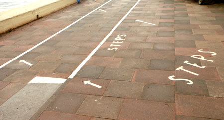
These (pretty shallow) steps in Dawlish, Devon, have been labelled as such, presumably because without this, some visitors wouldn’t notice, and would run, cycle or wheelchair down them and hurt themselves or others. Painting a white line along the edge is a common way of improving visibility of steps, but actual labelling is fairly unusual.
There is some argument that having to label an affordance in this way, rather than it being self-evident (e.g. by making the steps deeper, or putting a handrail, or something), is ‘bad design’, but I’m not sure one way or the other: from a utilitarian point of view, enormous labelling, however ‘ugly’, is probably a surer bet than providing subtle ‘cues’. Nevertheless, the poka-yoke approach would be to design out the problem entirely: make the whole thing a full-width ramp like the section at the side.
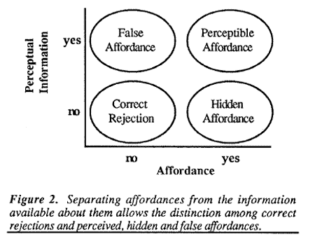
A diagram in Bill Gaver‘s classic paper ‘Technology Affordances‘ [PDF, 647 kb] sets out very clearly the importance of an affordance being perceived as such by a user:
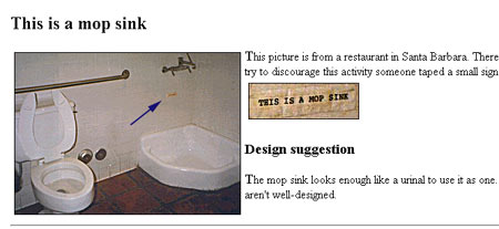
In this case we have a hidden affordance (not deliberately hidden) which has been un-hidden by the label – similar to (though not as funny as) the ‘This is a Mop Sink‘ example from Michael Darnell’s fantastic BadDesigns.com:
Pingback: Placebo buttons, false affordances and habit-forming
Pingback: By Any Means Necessary: Dirty Tricks in Britain’s War Against Teenagers | We Interrupt
Pingback: Design with Intent | Visual Lens: The Patterns