Bonjour / Goeiendag to visitors from Design for Persuasion: while you’re here, you might also like to download a free poster [PDF] which has 12 of the Design with Intent patterns on it in a handy reference form. Thanks for stopping by!
The Architectural Lens draws on techniques used to influence user behaviour in architecture, urban planning and related disciplines such as traffic management and crime prevention through environmental design (see also the Security lens).
While the techniques have been developed in the built environment, many of the ideas can also be applied in interaction and product design, even in software or services; they are effectively about using the structure of systems to influence behaviour.
Positioning & layout
“I wonder why they laid it out like that”
â– Arrange elements to affect how people use them–it can involve simply positioning elements (functions, buttons, etc) in sequence, hiding elements so they are only available for interaction in that sequence, or designing paths to converge or diverge intentionally
â– The layouts of supermarkets, shopping malls and offices can influence the paths taken by users, exposing them to the shelves, shops and colleagues in a strategic order or hierarchy
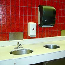
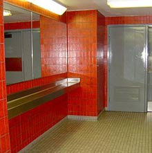
Examples: In this service station bathroom (above), the mirrors have been moved from behind the sinks to an intentionally awkward position near the door, so users don’t spend too long in front of them. See this discussion by Meagan Call.
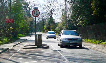
Chicane layouts (below) force drivers to yield priority to oncoming traffic, reducing speeds.
 This pattern is mainly about constraining user behaviour…
 but can also enable a user by making it easier to use/experience things in the ‘right’ order.
Material properties
“It’s much more comfortable if you use it this way rather than that way”
â– Use materials individually or in combination, chosen for particular properties which influence or affect user behaviour–e.g. comfortable chairs to encourage visitors to sit down, uncomfortable café seating to discourage long stays
â– A change in properties, such as the sudden roughness of rumble strips on the road, can signal to a user that a change in behaviour is appropriate
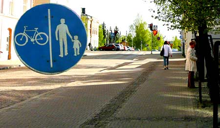
Examples: Rough-textured paving (above) can act as a subtle barrier
between the cycle and pedestrian tracks: stray over the line on a bike and you’ll feel it.
This bench on the Paris Métro (below) is intentionally too uncomfortable to act as anything other than a very temporary perch: it prevents sleeping or loitering.
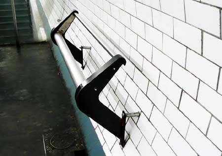
 This pattern is mainly about constraining user behaviour…
 but can also motivate a user, e.g. by ‘rewarding’ certain behaviour with comfort
[column width=”47%” padding=”6%”]
Segmentation & spacing
“One at a time, please”
â– Break up a system into multiple elements, spaced strategically to influence how a user can interact with them
â– Often used so users can interact with only one element at a time, or to make sure they share a system with others. Removing spacing, or integrating segmented elements, can also be used intentionally
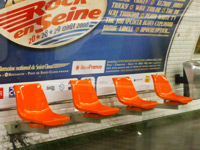
Example: These individual seats replace a bench on the Paris M̩tro Рmeaning that someone cannot lie down or occupy more than one.
[/column][column width=”47%” padding=”0%”]
Orientation
“Slanty design”
â– Use angled elements in a system to influence interaction, e.g. by making it easier or more difficult for some actions to occur than others. Also known as ‘slanty design’ (Russell Beale).
â– Can also be used to ‘funnel’ users, e.g. staggered pedestrian crossings making sure users face oncoming traffic
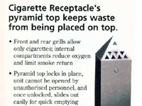
Example: Sloping lids on cigarette bins to discourage placing of litter on top
[/column][column width=”47%” padding=”6%”]
Removal
“You can’t use it if it isn’t there”
â– Simply remove system elements or cues which allow or encourage particular behaviours you don’t want to happen, or which would allow a user to proceed without thinking
â– Can also increase the transparency of a system, making it easier for users to see the consequences of their (and others’) actions
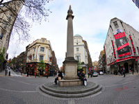
Example: The ‘naked roads’/’shared space’ approach of removing road markings and signage to influence more careful driving in urban areas, e.g. here at Seven Dials near Covent Garden in London
[/column][column width=”47%” padding=”0%”]
Movement & oscillation
“It’s brought right in front of you”
â– Dynamic system elements which move to guide users through a process or present things/functions to users in the order they should experience them – e.g. a conveyor belt in a factory or sushi bar
â– Can also be used to discourage users loitering, or blocking others’ paths, e.g. in a popular museum exhibit
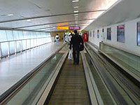
Example: A moving walkway (or an escalator), aside from making it easier for pedestrians to get about, also prevents them blocking the path of others
[/column][end_columns]
Photos by Dan Lockton, except service station bathroom by Meagan Call, cigarette bin from a printed version of the New Pig ‘pigalog’, and Seven Dials photo by Cheedarcheez, used under a Creative Commons by-nc-nd licence.
____________________
The Design with Intent Toolkit v0.9 by Dan Lockton, David Harrison and Neville A. Stanton
Introduction | Behaviour | Architectural lens | Errorproofing lens | Persuasive lens | Visual lens | Cognitive lens | Security lens
dan@danlockton.co.uk

Pingback: Design with Intent | The Design with Intent Toolkit v.0.9
Pingback: Frankie Roberto – Designing with Intent with Dan Lockton
Pingback: Design with Intent | Security Lens: The Patterns
Pingback: Paris Subway Usability Hacks | Betongelit
Pingback: What sort of behaviour? | Architectures | Dan Lockton