Bonjour / Goeiendag to visitors from Design for Persuasion: while you’re here, you might also like to download a free poster [PDF] which has 12 of the Design with Intent patterns on it in a handy reference form. Thanks for stopping by!
The Persuasive Lens represents the emerging field of persuasive technology, where computers, mobile phones and other systems with interfaces are used to persuade users: changing attitudes and so changing behaviour through contextual information, advice and guidance. The patterns here are based mainly on ideas from BJ Fogg’s Persuasive Technology: Using Computers to Change What We Think and Do and related work.
The major applications so far have been in influencing behaviour for social benefit, e.g. persuading people to give up bad habits, adopt healthier lifestyles or reduce their energy use.
Self-monitoring
“How is my behaviour affecting the system?”
â– Give the user feedback on the impact of the way a product is being used, or how well he or she is doing relative to a target or goal
â– Self-monitoring can involve real-time feedback on the consequences of different behaviours, so that the ‘correct’ next step can immediately be taken, but in other contexts, ‘summary’ monitoring may also be useful, such as giving the user a report of behaviour and its efficacy over a certain period. Over time, this can effectively ‘train’ the user into a better understanding of the system

Examples: Energy meters (above) of many kinds allow householders to see which appliances use the most electricity, and how much this is costing, whether or not they choose to act.
GreenPrint, a ‘better print preview’, provides users (and, in an office context, their bosses!) with a summary of the resources it’s helped save, environmentally and financially (below)

 This pattern is about enabling user behaviour: making it easier to make certain choices
Kairos
“What’s the best action for me to take right now?”
â– Suggest a behaviour to a user at the ‘opportune’ moment, i.e. when it would be most efficient or the most desirable next step to take
â– Often a system can ‘cue’ the suggested behaviour by reminding the user; suggestions can also help steer users away from incorrect behaviour next time they use the system, even if it’s too late this time

Examples: Automatic warning signs (above) can alert drivers to upcoming dangers at the right point for them to respond and slow down accordingly
Volvo once offered a gearchange suggestion light (below), helping drivers drive more efficiently and save fuel

 Kairos can be about enabling user behaviour at exactly the right moment…
 but can also motivate a user by increasing mindfulness right before action is taken.
[column width=”47%” padding=”6%”]
Reduction
“Just one click away…”
â– Simplification of tasks — thoughtful reduction in John Maeda’s terminology — makes it easier for users to follow the intended behaviour.
â– Using ‘shortcuts’ to remove cognitive load from the user (e.g. energy labels) can be very powerful, but be aware of the manipulation potential (see also framing). By removing stages where the user has to think about what he or she’s doing, you may also risk creating exactly the kind of mindless interaction that lies behind many of the problems you may be trying to solve!

Example: The Eco Button reduces the steps needed to put a computer into a low-power state, thus making it much easier for users to save energy.
[/column][column width=”47%” padding=”0%”]
Tailoring
“It’s like it knows me”
â– Tailor / personalise the information displayed or the way a system responds to individual users’ needs / abilities / situations, to engage users to interact in the intended way
â– Adaptive systems can learn about their users’ habits, preferences, etc and respond accordingly; simpler systems which can ‘detect’ some salient criteria and offer behavioural suggestions could also be effective

Example: The Pam personal activity monitor, by measuring acceleration rather than simply numbers of steps, allows the feedback it gives and exercise régimes it suggests to be tailored to the user, which allows it to be much more like a ‘personal trainer’ than a conventional pedometer.
[/column][column width=”47%” padding=”6%”]
Tunnelling
“Guide me, O thou great persuader”
â– Guided persuasion: a user ‘agrees’ to be routed through a sequence of pre-specified actions or events; commitment to following the process motivates the user to accept the outcome
â– B.J. Fogg uses the example of people voluntarily hiring personal trainers to guide them through fitness programmes (which also involves tailoring). Many software wizards which go beyond merely simplifying a process, into the area of shaping users’ choices, would also fit in here; there is the potential to lead users into taking actions they wouldn’t do in circumstances outside the tunnel, which must be carefully considered ethically.

Example: The installation wizard for the Foxit PDF Reader tries to get the user to ‘choose’ extra bundled installation options such as making ask.com the default search engine, by presenting them as default parts of the process. By this stage the user cannot exit the tunnel.
[/column][column width=”47%” padding=”0%”]
Feedback through form
“Look and feel”
â– Use the form of an object itself as a kind of interface, providing the user with feedback on the state of the system, or cues/suggestions of what to do next. It could be visual changes to the form, or haptic (i.e. sensed through touch)
â– This technique is often overlooked in rushing towards high-tech display solutions; can be as simple as something which intentionally deforms when used in a particular manner to give the user feedback, or changes shape to draw attention to the state it’s in

Example: The AWARE Puzzle Switch – designed by Loove Broms and Karin Ehrnberger gives more obvious feedback that a light switch is left on, through obvious ‘disorder’.
[/column][column width=”47%” padding=”6%”]
Simulation & feedforward
“What would happen if I did this?”
â– Provide a simulation or ‘feedforward’ showing users what consequences particular behaviours will have, compared with others: make cause and effect clearer to users
â– Showing users what will happen if they click ‘here’, or how many miles‘ fuel they have left if they continue driving as they are, tooltips, and even the ‘Preview’ and ‘Undo’ functions of common software, where changes can be easily tried out and then reversed/not applied, can all be considered kinds of feedforward or simulation

Example: Jakob Nielsen suggests that “a financial website could…encourage users to save more for retirement [by showing] a curve of the user’s growing nest egg and a photo of ‘the hotel you can afford to stay at when travelling to Hawaii after you retire’ for different levels of monthly investment”; interactive savings / loan simulators such as this from Yahoo! are increasingly common, and have the potential to influence user behaviour.
[/column][column width=”47%” padding=”0%”]
Operant conditioning
“Rewards for good behaviour”
â– Operant conditioning means reinforcing or ‘training’ particular user behaviour by rewarding it (or, indeed, punishing it). This could be a system where a user chooses to work towards a target behaviour, being rewarded for every bit of progress towards it, or something which periodically (perhaps unpredictably) rewards continued engagement, thus keeping users interacting (e.g. a fruit machine)
â– Sometimes the reward is a function of the system itself: saving energy naturally results in lower electricity bills. The system must make the user aware of this, though, otherwise a reinforcing effect is less likely to occur.

Example: E.g. Kai’s Power Tools (pioneering visual effects software) revealed ‘bonus functions’ to reward users who developed their skills with particular tools
[/column][column width=”47%” padding=”6%”]
Respondent conditioning
“Force of habit”
â– Respondent conditioning, also known as classical conditioning, can be applied to influence behaviour through helping users subconsciously associate particular actions with particular stimuli or settings, and responding accordingly: basically, developing habits which become reflexes. If you automatically feel for the light switch when you enter or leave a room, or brake when something appears in front of you on the road, this has effectively become a reflex action.
â– Using design, we could try to associate existing routines with new behaviours we would like – e.g. checking the house’s energy use when we look out of the window to see what the weather’s like outside, by fixing an energy display to the window (a concept by More Assocates / Onzo used this idea). Or we could try to undo these conditioned reflexes where they are damaging in some way to the user, by putting something else in the way.

Example: Smoking is often a conditioned reflex; many devices have been designed to try and undo or thwart this reflex when the user wants to quit, such as the Nicostopper, which stores 10 cigarettes and releases them only at pre-determined intervals.
[/column][column width=”47%” padding=”0%”]
Computers as social actors
“I like my Mac because it’s so friendly”
â– The media equation is the idea that “media equals real life”, i.e. that many people treat media (computers, TV, other systems) as if they were real people in terms of social interaction. If users believe that a computer (/system) is ‘on their side’, and helping them achieve their goals, it’s probably more likely they’ll follow advice given by the system: you can design systems to use ‘persuasive agents’, whether explicitly using simulated characters (e.g. in games) or by somehow giving the interface a personality.
â– If the system frustrates the user, advice is more likely to be ignored; equally, beware of the uncanny valley. As pervasive computing and artificial intelligence develop, establishing computers as ‘social actors’ in everyday life offers a lot of potential for more ‘persuasive products’.

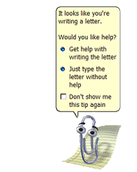
Example: Microsoft’s Office Assistants, including Clippit / Clippy here, were an attempt to give a helpful personality to Office, but proved unpopular enough with many users that Microsoft phased them out.
[/column][end_columns]
Photos/screenshots by Dan Lockton except Volvo 340/360 dashboard courtesy Volvo 300 Mania forum, Eco Button from Eco Button website, Pam personal activity monitor from About.com, AWARE Puzzle Switch from Interactive Institute website, loan simulator screenshot from Yahoo! 7 Finance, and Nicostopper from Nicostopper website.
____________________
The Design with Intent Toolkit v0.9 by Dan Lockton, David Harrison and Neville A. Stanton
Introduction | Behaviour | Architectural lens | Errorproofing lens | Persuasive lens | Visual lens | Cognitive lens | Security lens
dan@danlockton.co.uk

Pingback: Design with Intent | The Design with Intent Toolkit v.0.9
Pingback: Design with Intent | Some interesting projects (Part 2)
Pingback: Design with Intent | What’s been going on recently
Pingback: Design with Intent | Thoughts on the ‘fun theory’
Pingback: Johnny Holland - It’s all about interaction » Blog Archive » When Data Gets Up Close and Personal