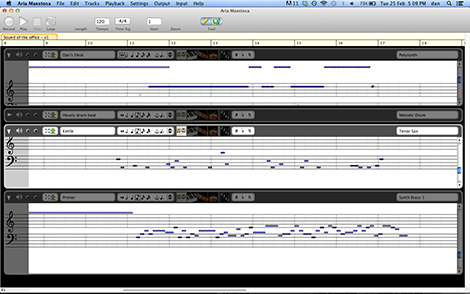
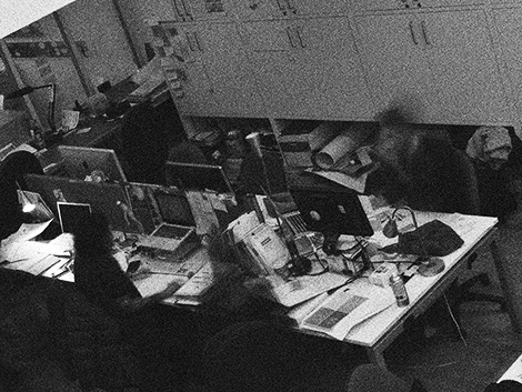
The three instruments you hear here represent the electricity use of three items of office infrastructure – the kettle, a laser printer, and a gang socket for a row of desks – in the Helen Hamlyn Centre office over 12 hours from midnight on a Sunday to lunchtime on a Monday, in December, monitored using CurrentCost IAMs. The figures were scaled to provide ranges that sounded better, and converted into a MIDI file using John Walker’s csvmidi and then Aria Maestosa.
The ‘ticks’ indicate each hour’s passing. The ‘honk’ (Tenor Sax) is the kettle (up to 1.5kW when in use). The ‘whine’ (Synth Brass 1) is the Kyocera laser printer. The other synth (Polysynth) is the gang socket, which mainly had a couple of laptops (15W-50W) plugged into it when people were in the office, and a charger (1W) plugged into it otherwise . Lower pitch indicates greater electricity use, hence the high-pitched whine is the background power of the printer (about 10W on standby, rising to 300W-500W when in use).
As the audio starts, you can hear, over the background whine of the printer, the kettle come on as the security guard makes himself a middle-of-the-night cup of tea. Then, early in the morning, the kettle is used three times by the cleaners – twice in quick succession (reboiling?) and then once again. Suddenly, from 9.30, as office staff arrive, the kettle goes on again, laptops are plugged in, the printer starts printing and the energetic hubbub of office life becomes apparent.

Data sonification has been in the news a bit recently, from Domenico Vicinanza’s ‘Sound of Space Discovery’ to Opower’s ‘Chicago in the Wintertime’. It’s something that’s long intrigued me, but if I’m honest, has underwhelmed me in terms of either its actual utility or indeed its impact aesthetically. A (visual) graph is useful because I can use it to find something out. A table of numbers, likewise, even if patterns are less immediately evident. But a beautiful orchestral piece that just happens to draw on aggregated data which are a long way from anything I can comprehend, in scale or meaning, doesn’t tell me anything, somehow. Sarah Angliss was pretty much spot-on in this 2011 Mad Art Lab post.
Energy use is the focus of one of the main projects I’m working on, and one of the strongest findings that came out of interviews and co-creation work with householders that Flora Bowden and I did last summer and autumn was the notion that the invisibility of energy was a major component of householders’ lack of understanding, which contributed – by their own admission – to energy waste.
More than one person specifically suggested that being able to ‘listen’ to whether appliances were switched on or not, and, more interestingly, what state they were in (e.g. listening to a washing machine will give you a good idea as to where it is in its cycle), was potentially more useful for understanding how to reduce energy use than a flashy visual display or dashboard. Sound is potentially even more ‘glanceable’ than glanceables. Even hearing what you’d left on as you went out of the door would be useful. There are echoes of Mark Weiser’s Calm Technology including Natalie Jeremijenko’s Live Wire (Dangling String) but also the ‘useful side-effects’ of things like the ‘clacking’ sound of mechanical railway departure boards as an indicator that the display has updated, as Adrian McEwen and Hakim Cassimally point out in their excellent Designing the Internet of Things.
@danlockton @AaronTinjum My father used to make me listen to fluctuating 50Hz hum of fridge (he was a power station commissioning engineer)
— Oliver Payne (@oliverpayne) November 20, 2013
We also explored aspects of this idea further in our Seeing Things project with RCA students back in November, with contributors including Dave Cranmer and Dagny Rewera having an audio/visual sensory translation element to their work. Of the participants, Ted Hunt took an explicitly multi-sensory approach with his project, including audio, while Francesco Tacchini, with Julinka Ebhardt and Will Yates-Johnson, subsequently went on to create the incredible Space Replay where audio is both monitored and played back in public space.
I’m not saying the ‘Sound of the office’ audio above is particularly good. It was more of a let’s-play-around-with-some-data experiment, and I’ve since found that proper sonification platforms exist. But the approach is something I very much want to explore and build on – possibly whole-house energy use audio disaggregated by appliance, or by activity – and it raises so many interesting questions around what is most useful or most effective at actually either influencing energy use, or helping people understand the complex systems around them. Should it be aesthetically pleasing, or horrible enough it triggers you to turn things off? Is that just the kind of over-simplification that makes most energy monitor displays ineffective? Should the audio be real-time or provide a summary? Should it be paired with visuals? (e.g. like Alexander Chen’s beautiful MTA.ME or Listen to Bitcoin / Listen to Wikipedia) How much should it try to be ‘music’ versus, basically an ‘auditory affordance’ or alarm system? Should there be something about the quality of the sound that indicates something, e.g. load on the National Grid? (Thanks to Aideen McConville and Jack Kelly for this suggestion.)
The field is interesting partly because, post-PhD, I’ve come to realise that what I’m interested in is not so much the question of “how do we influence behaviour?” as an end in itself, but something more like “how do people understand complex systems of which their behaviour is a part, and how do we help them understand those systems better?”. There’s a substantial blog post coming on that, which hopefully draws together lots of interests and ideas, from the IoT to heuristics to seamfulness to affordances to mental models, and (I hope) will set out a kind of research programme which I might be able to get some funding for. But in the meantime, this is certainly part of the direction we’re going in with the ‘energy feedback’ part of the RCA’s work on the SusLab project. It’s going to be ambient, and it’s going to involve more than just numbers and graphs.
Direct link for MP3 file


Pingback: Sound of the office: energy data sonification | SusLab at the RCA
Pingback: Introducing Powerchord (Blackbird edition) | Architectures | Dan Lockton