Bonjour / Goeiendag to visitors from Design for Persuasion: while you’re here, you might also like to download a free poster [PDF] which has 12 of the Design with Intent patterns on it in a handy reference form. Thanks for stopping by!
The Cognitive Lens draws on research in behavioural economics and cognitive psychology looking at how people make decisions, and how this is affected by ‘heuristics’ and ‘biases’. If designers understand how users make interaction decisions, that knowledge can be used to influence interaction behaviour.
Equally, where users often make poor decisions, design can help counter this, although this risks the accusation of design becoming a tool of the ‘nanny state’ which ‘knows what’s best’.
Many dozens of cognitive biases and heuristics have been identified by psychologists and behavioural economists, a lot of which could potentially be applied to the design of products and services. The seven detailed below are some of the most commonly used; this selection draws heavily on the work of Robert Cialdini.
Social proof
“What do other users like me do in this situation?”
â– Users will often decide what to do based on what those around them do (the conformity bias), or how popular an option is; make use of this strategically to influence behaviours
â– Social proof works especially well when there is a peer group or users identify with (or aspire to joining) the group against whose behaviour theirs is being compared; an element of competition can be intentionally introduced

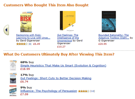
Examples: Facebook’s ‘n of your friends added x application’ (above), Amazon’s various recommendation features, and statistics announcing the popularity of a particular website or product, such as the Feedburner ‘chicklet’ here all imply that ‘people like you are doing this, therefore you might want to as well’

 Social proof is mainly about motivating user behaviour…
 but can also enable a user to ‘know’ what to do, by making it easier to see how others are doing it.
Framing
“Well, if you put it that way…”
â– Present choices to a user in a way that ‘frames’ perceptions and so influences behaviour, e.g. framing energy saving as ‘saving you money’ rather than ‘saving the environment’; categorise functions strategically so that users perceive them as being related
â– An obvious principle to many designers (and politicians, and estate agents); there are many possible framing tactics, such as use of language to give positive / negative associations to options (e.g. ‘sports suspension’ sounds better than ‘hard suspension’). Often used to deceive customers

Examples: Starbucks’ drink sizes–at least on the menu (above)–start with ‘tall’, framing the implied range of sizes much further up the scale, to avoid any negative or mediocre implications that ‘small’ or ‘medium’ might have.
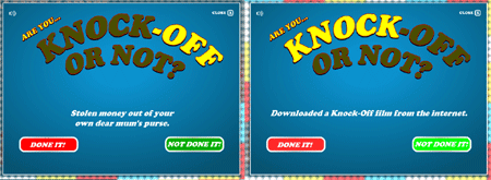
The ‘Knock-off Nigel’ anti-DVD-copying campaign (below) frames crimes against another person, such as theft of money, in the same bracket as downloading a movie, to imply that people who engage in one also engage in the other.

 Framing is about motivating people to behave in particular ways.
[column width=”47%” padding=”6%”]
Reciprocation
“Return the favour”
â– Users often feel obliged to return ‘favours’: design systems which encourage users to trade or share information or resources
â– Can involve ‘guilting’ the user, but best if the user genuinely wants to return a favour

Example: This message from the BitTorrent client Azureus (now Vuze) encourages users to ‘reciprocate’ for having downloaded a file by continuing to seed it
[/column][column width=”47%” padding=”0%”]
Commitment & consistency
“Stick to the plan”
â– Get users to commit in some way to an idea or goal; they’re then more likely to behave in accordance with this to appear or feel ‘consistent’
â– Can be used less ethically (e.g. the ‘irrational escalation of commitment’ involved in Swoopo)

Example: Voluntarily choosing to have a water meter installed can demonstrate some commitment to reducing water, which may persist as a household tries to remain consistent with the commitment.
[/column][column width=”47%” padding=”6%”]
Affective engagement
“Getting emotionally involved”
â– Design ‘affective’ products and systems to evoke emotional response as a way of engaging users and influencing attitudes and behaviours
â– Designers have traditionally been very good at manipulating aesthetics to inspire emotional response, but new technologies allow new opportunities, especially with gaming.

Example: Using smiling (or frowning) faces on customers’ electricity bills can increase the emotional response associated with the bill, and lead to (slight) reductions in electricity use. By comparing customers’ use to their neighbours, this strategy also made use of social proof
[/column][column width=”47%” padding=”0%”]
Authority
“She know’s what she’s doing”
â– Many users will behave as suggested by an ‘authority figure’ or expert even if that behaviour is outside what they would consider normal; systems can be designed to make use of this effect
â– At least three mechanisms at work here: ‘appeal to authority’ in terms of attitude / behaviour guidance, perceived threat to users who ‘disobey’ authoritative messages, and desire to become more like the ‘pros’ by imitation


Example: How much of Twitter’s success at engaging users to join and participate has been due to well-publicised ‘authority’ figures embracing it?
[/column][column width=”47%” padding=”6%”]
Scarcity
“Not much left, better use it wisely”
â– Whether scarcity is real or not in a situation, if it’s perceived to be, users may value something more, and so alter their behaviour in response: design systems strategically to emphasise the scarcity of a resource
â– Can be down to loss aversion; artificial scarcity can also be introduced (e.g. digital rights management)

Example: Digital fuel gauges showing the remaining range on the current tank can help concentrate drivers’ minds on the scarcity value of the fuel. See also self-monitoring.
[/column][end_columns]
Photos and screenshots by Dan Lockton, except Starbucks menu by Miss Shari on Flickr and water meter by Phatcontroller.
____________________
The Design with Intent Toolkit v0.9 by Dan Lockton, David Harrison and Neville A. Stanton
Introduction | Behaviour | Architectural lens | Errorproofing lens | Persuasive lens | Visual lens | Cognitive lens | Security lens
dan@danlockton.co.uk

Pingback: Design with Intent | The Design with Intent Toolkit v.0.9
Pingback: Design with Intent | Cialdini on the Beach
Pingback: Design with Intent | Persuasive Lens: The Patterns
Pingback: Design with Intent | Visual Lens: The Patterns
Pingback: Design with Intent | Through London with the DwI goggles on
Pingback: Design with Intent | What’s happening with the toolkit (Part 2): Interaction design: how you can be part of it
Pingback: Design with Intent | What I didn’t get round to writing about in 2009
Pingback: Anonymous
Pingback: Projektowanie perswazyjne – czego możemy nauczyć siÄ™ od twórców gier
Pingback: Users do the darndest things « Technical Communication at UAHuntsville