As I’ve admitted before, having the idea of ‘design that’s intended to influence behaviour’ on my mind a lot of the time does sometimes lead to seeing everything with that filter in place:
[It’s] a kind of conspiracy bias, ascribing to design intent that which is perhaps more likely to be due to situational factors (a kind of fundamental attribution error for design), or inferring the intention behind a design by looking at its results.
Nevertheless, it’s not unexciting. Noticing things I’d never have noticed before I started doing this research – often details or tricks that have been pointed out by commenters here on the blog – can give you a feeling of deeper connection to the design of the products and systems and environments around us. Things are designed to influence how people use them, what people do and don’t do, whether we are conscious of it or not. So here are some observations – none of them terribly amazing! – from a recent day in London with a camera and my long-suffering girlfriend. There are hundreds more I could have included – everything from elements of the websites we looked at before travelling, to the layout of stations and streets and buildings and tables and chairs and the wording and order of menus and adverts and just about everything that’s been designed to elicit some kind of behavioural response. But we just don’t notice most of this: it’s only occasionally that things attract our attention, which is what happened with the following examples.
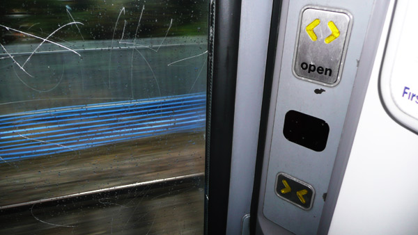
The ‘Open Door’ buttons on First Great Western’s Class 165/166 trains (going into Paddington) are much larger than the ‘Close Door’ buttons (which rarely need to be pressed anyway, since the doors are closed automatically before the train departs). I’m assuming they’re intentionally more prominent because it’s the button that people need to see and press in a hurry if they need to get off and the vestibule(?) area’s crowded (and it often is on this service), and larger for a kind of Fitts’ Law reason: reducing the time taken to ‘acquire the target’. It’s also large enough to be able to elbow it or press it with a shoulder if you’re carrying things in both hands.
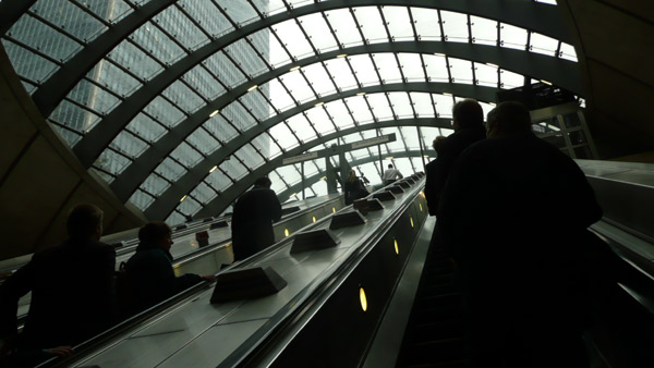
The escalators at Canary Wharf underground station, as at many others, have raised obstructions (often masquerading as “Stand on the right” signs) every couple of feet to prevent people sliding down the panelling between the handrails. When I looked at this before – the slightly more extreme spikes at Highbury & Islington station – there were some great comments including a story about what can happen when they obstructions aren’t present (or rather when just one is – a large sign at the bottom). It did occur to me that the kind used at Canary Wharf would actually work quite well as hand-holds for climbing up, should you want to.
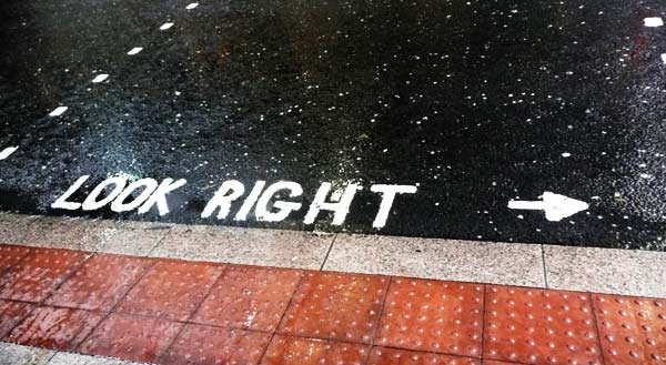
All over the UK, but particularly in urban areas with complex traffic movements, one-way systems or lots of visitors, such as here outside the DLR station at Canary Wharf, some pedestrian crossings are marked with “Look Right”, “Look Left” or “Look Both Ways” on the road, to suggest to pedestrians (at just the right moment) which way they should look to watch out for oncoming traffic. Richard Thaler has mentioned this as a ‘nudge’ example before. It doesn’t always get implemented correctly; there are also other design tricks for influencing pedestrians to face the right way at crossings.
I might be going beyond my expertise here, but it seems like it’s actually relatively unusual in much of Europe (perhaps because of the Vienna Convention) to have instructional ‘injunctive’ text on traffic signage (including markings), compared with some other parts of the world. For example, in the UK, since the 1960s at least we very rarely have signs such as “Wrong Way, Go Back” – there would more likely be a “No Entry” sign, with no text. If you’re interested in British road signage, this is one of the best articles on the subject.
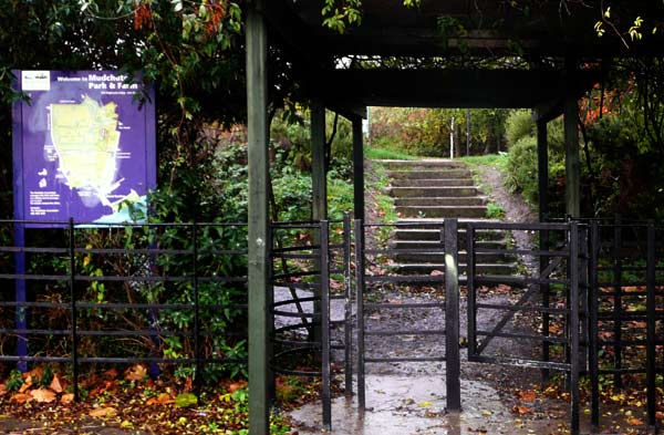
Here’s a ‘kissing gate’ at Mudchute Park presumably intended to prevent bicycles (though I would have thought a bike could fit through the gate next to it). As we’ve seen before, trying to stop cyclists using awkward gates doesn’t always work. Given the location of this gate, it may also help prevent any animals which have escaped from the the farm from running out onto the road.
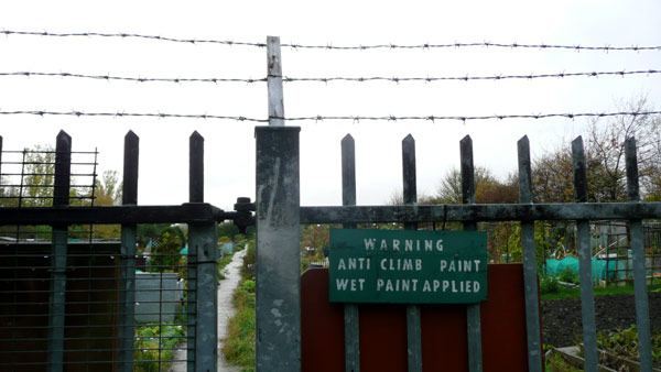
Also at Mudchute, these allotments have anti-climb paint applied to the fence – a slippery paint that stays ‘wet’ (here’s a nice publicity photo). I’ll be honest, I’ve often wondered how much effect this stuff really has against someone equipped with, say, rough-textured gloves who could, at least on a fence like the one in the picture, probably get his/her hand all the way round both the horizontal and vertical parts of the fence. Or just a loop of rope, or a hook, along with black clothes (to hide the paint that comes off) or disposable overalls plus some kind of disposable blanket or rug to cover the spikes and flatten the barbed wire would seem to be all you need. I’m not condoning this, of course – as an allotmenteer myself, I appreciate that they can well be an attractive target.
As an alternative to anti-climb paint, spikes, etc, these roller bars seem quite interesting.
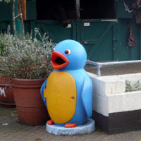
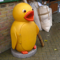
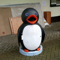
The yard of the Mudchute Kitchen, part of the farm, has these friendly rubbish bins – a great example of affective engagement, particularly somewhere where there are going to be lots of young children visiting on school trips or with families. The open beaks are an invitation, a perceived affordance that they should be ‘fed’. Whether it’s a good idea to ‘teach’ children to feed litter to birds is another matter…
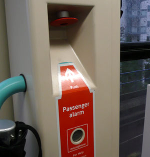
Unlike the ‘Open Door’ button above – which doesn’t matter if it’s accidentally pressed since it only operates when the train is stationary and alongside the platform – passenger emergency alarms such as this type on the Docklands Light Railway need to be prominent and visible, yet protected against accidental operation due to, for example, someone leaning on the button when the train is crowded. So, not only recessing it, but mounting it at the top of the recess, where even an inadvertent poke from an umbrella or elbow is less likely to make contact, is a clever errorproofing solution.
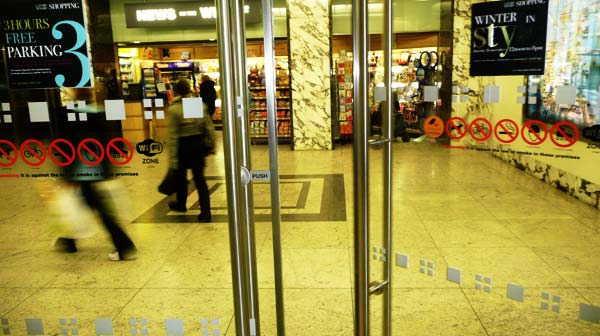
The shopping mall at Canary Wharf features ‘Norman doors‘ that despite having prominent, elegant, no doubt expensive stainless steel handles, must actually be pushed open, hence the necessity of the ‘Push’ labels. Other than being able to pull the doors closed if necessary, or simply because it’s cheaper to make doors with the same fittings on both sides so they can be hinged either way, I’m not sure why this particular category of false affordance is so common. Making the handles flatter on the ‘push’ side would preserve a similar style visually but signal that they need to be pushed without needing to resort to a sign.
Couple of other observations: the comprehensive row of prohibition signs on the doors almost forms a design element itself, echoing the pattern of squares further down. You’re not allowed to do much other than spend money in this particular mall. Also, printing the word STYLE on posters in reflective foil does, unfortunately, mean that from some angles, the L and E will disappear.
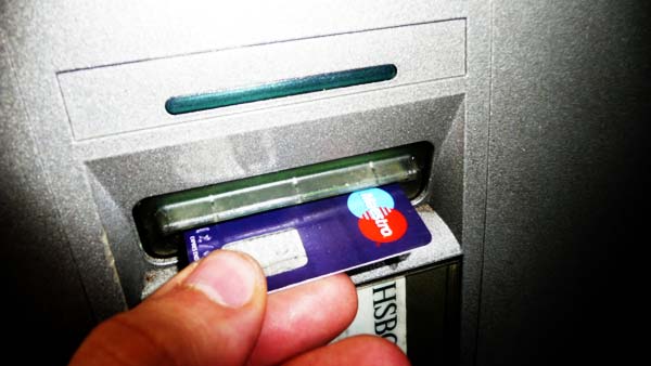
Getting some money out: we’re so used to ATMs returning the card before dispensing the cash that we often don’t even think about this interlock forcing function. In fact it may even momentarily surprise us when ticket machines (for example) don’t work like this.
But ATMs didn’t always operate like this either, and when the cash was returned first, the card was often forgotten. So the order was changed – as Phillip Chung & Michael Byrne put it “to place the hanging postcompletion action ‘on the critical path’ to reduce or eliminate [its] omission” – although this card-then-cash format is by no means universal.
I looked at some possible alternative solutions for the problem in this paper for Applied Ergonomics (e-mail me if you’d like a copy), as a kind of test / demonstration of the Design with Intent toolkit.
(The above is actually a photo of a different machine to the one I used on this particular day, since there was a queue of people behind me)
These friendly anti-sit spikes (including a slightly crooked one on the left) outside the headquarters of London Councils in Southwark just scream “We love the public!”. I guess the alcove could provide a useful hiding place for someone to jump out on passers-by or something.
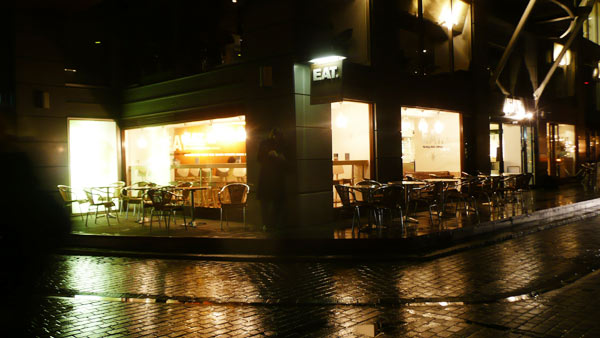
Further along the South Bank, this branch of Eat reminded me that B J Fogg used a photo of the Eat sign in his talk at Design for Persuasion, as an example of what he calls hot triggers: cues or calls to action which actually prompt a behaviour, assuming that the motivation and ability are there already. Someone walking along, hungry (motivated), with enough money to buy food (ability) needs a trigger, and a sign pretty much instructing one to eat is a particularly clear one. We didn’t eat there, of course – there are better places – but it’s an interesting tactic.
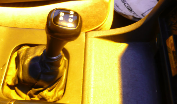
Finally, as we were about to drive home from the station, I thought about the reverse gear ‘gate’ – a kind of lock-out – which prevents the driver changing accidentally directly from a forward gear into reverse (though it’s usually possible the other way round). Depending on the gearbox, you generally need to lift the gearstick over the ‘gate’ or press a button while moving the stick, or in the case of my Reliant Scimitar (which has a 1980s Ford Sierra gearbox), press the gearstick itself downwards.
What do you see everyday that makes you think “they designed it like that so that people would do this”?
7 Comments