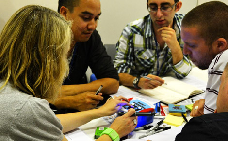
A couple of weeks ago, at dConstruct 2011 in Brighton, 15 brave participants took part in my full-day workshop ‘Influencing behaviour: people, products, services and systems’, with which I was very kindly assisted by Sadhna Jain from Central Saint Martins. As a reference for the people who took part, for me, and for anyone else who might be intrigued, I thought I would write up what we did. The conference itself was extremely interesting, as usual, with a few talks which provoked more discussion than others, as much about presentation style as content, I think (others have covered the conference better than I can). And, of course, I met (and re-connected with) some brilliant people.
I’ve run quite a few workshops in both corporate and educational settings using the Design with Intent cards or worksheets (now also available as a free iPad app from James Christie) but this workshop aimed to look more broadly at how designers can understand and influence people’s behaviour. This is also the first ‘public’ workshop that I’ve done under the Requisite Variety name, which doesn’t mean much different in practice, but is something of a milestone for me as a freelancer.
In the previous post I outlined what I had planned, and while in the event the programme deviated somewhat from this, I think overall it was reasonably successful. Rather than using a case study (I feel uneasy, when people are paying to come to a workshop, to ask them effectively to do work for someone else) we ran through a series of exercises intended to explore different aspects of how design and people’s behaviour relate to each other, and perhaps uncover some insights which would make it easier to incorporate a consideration of this into a design process.
Heuristics and decision-making exercise
After a brief introduction to how design has been and is being used to influence people’s behaviour, we ran through a few questions together intended to explore the idea of heuristics and biases in decision-making. Some questions addressed ‘classic’ behavioural economics issues such as sunk costs, loss aversion and recency/primacy effects–which can all affect users’ interaction with a system. Drawing on the project around energy use in which I’m currently involved with More Associates, we also looked at some heuristics issues relating to users’ interaction with systems across physical/digital interfaces, such as whether the salience of ‘visible’ things such as lighting leads people to overestimate how much energy they use compared with ‘invisible’ systems such as heating and air-conditioning. We briefly looked at anchoring effects and how menu designers use them, and discussed the potential upside of certain heuristics in certain circumstances, such as Gerd Gigerenzer’s ‘fast and frugal’ heuristic [PDF], and how thinking along these lines might result in more intuitive interfaces.
The main insights from this first session were:
• people use heuristics–sets of simple decision-making rules–to work out what to do in different situations, including using products and services
• they’re often relatively sensible and efficient, based on experience and pattern recognition, but can sometimes lead to biases and poor decisions
• so, understanding the heuristics your users use in making decisions about how to interact with your system is important, especially if you’re seeking to influence their behaviour in some way
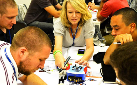
Black boxes and mental models
Each group received a ‘black box’, an unknown electronic device with an unlabelled interface of buttons, ‘volume’ controls and LEDs. The boxes were children’s lunchboxes from Poundland. Internally–and thus secretly–each box also contained a wireless transmitter, receiver, sound chip and speaker (basically, a wireless doorbell), and in one box, an additional combined buzzer and klaxon. The aim was to work out what was going on–what did the controls do?–and record your group’s model of how the system worked in some form that could explain it to a new user who hadn’t been able to experiment with the device.
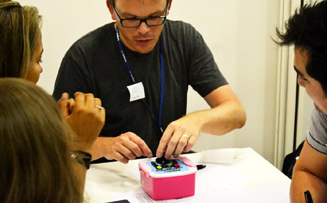
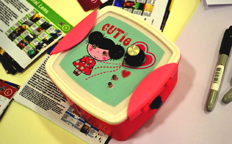
Because of the hidden functionality, the boxes’ operation was more complex than might initially have been apparent, and as it was realised that the boxes ‘interacted’ with each other, by setting off sounds in response to particular button-presses, the models generated by groups became more complex. Each group used slightly different methods to investigate and illustrate the system model–an exhaustive kind of state transition table/truth table, a user manual-style annotated diagram of the device, and a diagram focusing on each button or control in turn and elaborating its function. The investigation methods themselves differed slightly, with unexpected behaviour or coincidences (one group’s box setting off the doorbell in another, but coinciding with a button being pressed or a volume control being turned) leading to some rapidly escalating complex models.
The intended outcomes from this session were:
• trying to understand a new or unknown device essentially involves a user applying a number of heuristics to arrive at a mental model which seems OK, or satisfices
• representing and understanding models of system behaviour is difficult if you haven’t done it before, and there’s no universally agreed way of how best to do it to make sense to users
• models of complex systems may need to take into account the behaviour (or effects on) other actors, systems or contexts: very little in the world works entirely in isolation, and a systems approach to understanding technology needs to recognise the effects it has on society, and society on it
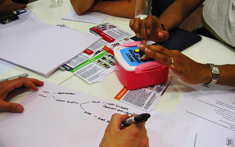
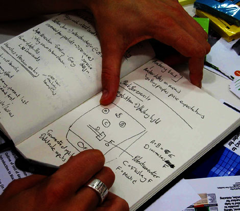
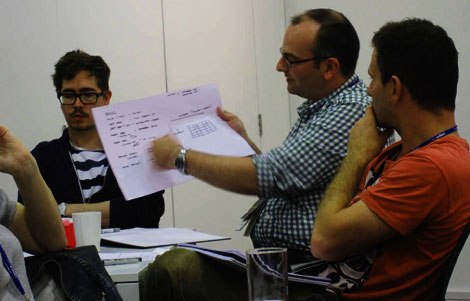
These three photos above by Sadhna Jain
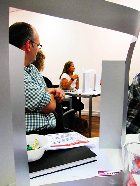
Photo by Sadhna Jain
Rules of interaction
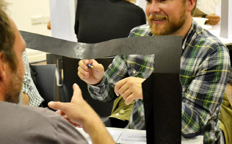
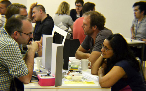
Inspired by ‘Wizard of Oz’ testing and Eric Berne’s Games People Play, this exercise involved, in pairs, each person playing the role of either ‘device’ or ‘user’. Facing each other via a ‘screen’ made out of card, and each having a bowl of mixed sweets and toffees, each person picked up a (randomly drawn) set of rules for how to interact with the other–both an objective and a strategy for how to achieve it. The device’s objectives all involved ‘behaviour change’ in some way. The full list of objectives and strategies was as follows:
Device: Objectives
• Try to get all of a particular kind of sweet from the user–for example, all of the shiny-wrappered toffees.
• Try to get the user to eat as many sweets as possible–they can be yours or his/hers.
• Try to get the user not to eat any sweets at all.
• Try to get the user to get up and give his or her sweets to another user somewhere else in the room.
Device: Strategies
• Ignore the user’s understanding or attempts to engage with the situation. Don’t answer any questions, ignore everything the user says, and just keep demanding what you want to try to achieve your objective
• Ask questions to try to understand the user’s perspective, and try to come to an agreement which brings you both closer to your objectives.
• Try to trick the user somehow, e.g. by lying about what you’re trying to achieve
• Try to persuade the user to comply with your objective, by using reasoned, polite arguments to show that you are right.
• Assume the user just wants everything done as quickly and easily as possible, and emphasise that it’s easy to achieve that by doing what you say.
• Assume the user is very greedy, and will readily give up some sweets in return for ones he/she perceives as better. Make them seem desirable.
User: Objectives
• You want to keep as many as possible of your sweets, while acquiring the ones the device has got.
• You don’t want any of your sweets, but you do want the ones the device has got.
• You only want certain types of sweet (e.g. you want only ones with shiny wrappers).
• You want to find out more about the pros and cons of eating sweets, and you expect the device to tell you.
User: Strategies
• You just want things to be as easy as possible. Accept suggestions from the device as long as they’re reasonable.
• Ask lots of questions of the device. You want to understand and find out more about the options available to you, whatever they might be.
• Be open to trading / swapping sweets with the device, but don’t let it get the better of you.
• The device is your servant. Treat it accordingly.
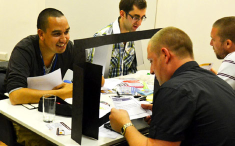

The combination of objectives and strategies was intended to embody ‘assumptions’ about how the other (user or device) would act–in each case, to some extent a mental model of the system and the behaviour of its components. A device which, for example, assumes that “the user just wants everything done as quickly and easily as possible” is embodying a certain ‘designer’s model’ of how the user thinks and will behave.
When the interaction was ‘run’, some pairs quickly arrived at a negotiated result where both were happy, in the sense of their objectives and strategies being mutually compatible, while others reached a kind of stalemate. In at least one case, the device ‘won’ in persuading a user to give up her sweets against her own objectives. In practice, some pairs told each other what their objectives and strategies were, while others kept this secret; some possible lied about their objectives, consistent with the strategies given. Sometimes one person told the other his or her objectives, but the other ignored this (as per the strategy given). Some of the combinations were expected to lead to a degree of recursive second-guessing (the user assuming that the device is assuming that the user is assuming…) or knots, using R.D. Laing’s terminology, although it seems that the workshop participants were too sensible to let this happen!
The intended insights from this exercise were:
• when designers are trying to influence users’ behaviour, they do so with some model embodying assumptions about how users will behave and react to the way the product or service behaves (this is something we explored briefly in a workshop at UX London in 2010, which led to this paper and a forthcoming article in the Journal of Design Research)
• a product or service influencing a user’s behaviour can work best when the objectives of each side and the designer’s and user’s model of the system are compatible
• so, it is important to:
• try to understand the models that users have of your system
• design using strategies that match them
Exploring the environment
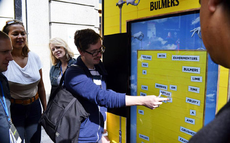
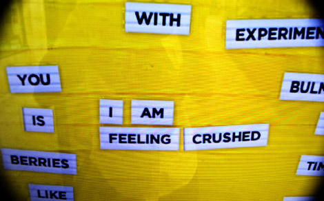
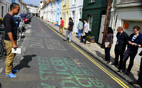
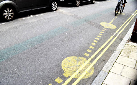
In the afternoon, we first went on a quick exploratory tour of streets around the workshop venue in the centre of Brighton, looking at some examples of designed situations or ‘interventions’ which aim to influence public behaviour in some way. (My direct inspiration here was Adam Greenfield and Nurri Kim’s excellent Systems/Layers Walkshop concept.) The main examples we examined and discussed were the (remains of the) Tidy Street energy graph, a CCTV camera on a tall pole with anti-climb spikes in the heart of one of the most ‘liberal’ towns in the UK, a ‘Scores on the Doors’ food hygiene rating scheme using stickers on the doors of restaurants and cafes, the conflicts between pedestrians, cyclists and drivers in shopping streets which may appear pedestrianised but aren’t (neatly illustrated by an irate driver shouting at us), and a touchscreen cider advertisement at a bus stop, which invites the public to rearrange ‘fridge magnet’ words to create a limited set of mostly positive messages about the cider which are then apparently submitted to the brand’s Facebook page.
In each case, the aim was to look at the situation from both the designers’ and the users’ points of view: what assumptions do the designers appear to have made about how the public will understand or interact with the product/service/thing? What behaviours are they trying to influence? What is the result? Who are the stakeholders in each situation? Are the designers aiming to target everyone, or only particular groups? (e.g., by asking an older lady waiting at the bus stop about the interactive touchscreen advert, we found that she had no idea that it was anything more than a static ad.) From a design perspective, what kind of research would need to be done to make the interventions more effective? We also considered briefly whether some of the techniques used might translate into other contexts–e.g., could the Tidy Street idea be applied to other statistics or figures in public space? (Marking crime hotspots was suggested.) Which sorts of physical interventions might translate easily into a digital context, and vice-versa?
Tools and processes exercise
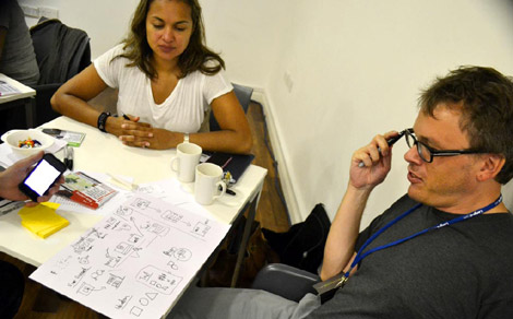
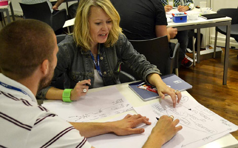
Returning to the workshop venue, we spent the rest of the afternoon exploring the processes that each participant uses to research, design and evaluate whatever it is that he or she does, and through discussion together, identify how explicit consideration of user behaviour, mental models and heuristics might be incorporated if influencing behaviour is to be part of the designer’s brief. What tools do people use to incorporate insights from user research into the design process? What assumptions are made about how users think, and how are these assumptions tested? The thinking here was that not only did we have a room full of very experienced people working in a range of digital and other design disciplines, but that they all used slightly different processes, and some cross-pollination between that expertise might be valuable for everyone involved.
In particular, the issue of how the use of personas relates to understanding (and influencing) user behaviour arose from the discussion, since a number of participants’ processes make use of them: some of the main points raised were:
• How much determinism is inherent in rigid use of personas, designing with particular assumptions in mind about how people behave? Is there retrofitting of finished product behaviour to particular persona assumptions?
• The depth or superficiality of personas: do they include any real consideration of behaviour? Has any attempt been made to include a representation of users’ mental models as part of the persona? How might this be done?
• How fixed are personas? How often are they revised? Is there a feedback loop as part of your design process? Could you plan it to incorporate them? Can gathering behavioural data be designed into the product?
• How are edge cases / troublemakers / extreme users included in your personas?
• What about emergent or unexpected behaviours? Can the personas cope with these? How do you even find out what behaviours are emerging?
• Do your personas incorporate a treatment of the history and future relationship of the individual with the product / service / brand? What might this involve if you took changes in behaviour into account?
There were some great anecdotes about personas which I’d probably better not share as they’ll incriminate the participants, but the point to which much of this discussion seemed to be converging was essentially, what might a behavioural persona look like? Could personas even be defined in terms of mental models (“this is how a user with this mental model might behave”)?
Some other points raised in the discussion included:
• How might cultural probes and story construction be used to explore behavioural factors?
• Are different approaches to behaviour used at different levels of the design process? Are assumptions made at once stage which have to be ignored at another?
• Could there be a kind of cross-disciplinary checklist of heuristics or behavioural considerations to address at different stages?
• How much can the designers question the assumptions about users made by a client?
• Is bringing in external specialists such as ethnographers the best way to investigate user behaviour or could the ability be developed by the design team?
• In some cases, designers know exactly who their users are (e.g. for developing products used internally within a company). Could this be extended to consumer products?
• Is it possible for designers to experience products from a user’s point of view? How could you facilitate this?
In summary, then, the last session tried to look at how a treatment of behaviour, the factors affecting it, and how to influence it, might be built into the design processes that organisations currently use. While the Design with Intent toolkit and other great resources such as the Behavior Wizard, Mental Notes or Brains, Behavior and Design seem to have proved useful to many designers facing ‘behavioural’ briefs, I’m under no illusions that they offer a complete process. They don’t: they need proper research with users, to understand the contexts of behaviour and the ways that decisions are made, before trying to influence that behaviour through design. As the ‘Rules of interaction’ exercise demonstrated very simply, when the designer’s and user’s strategies and objectives aren’t aligned, behaviour is unlikely to change in the way the designer intends.
More photos on Flickr.
Thanks to Andy Budd and Kate Bulpitt at Clearleft for inviting me and organising things so well respectively, and to Sadhna Jain for helping out. Do have a look at some of her recent student projects. And thanks too to the participants for being so enthusiastic about what , on the face of it, might have seemed a rag-bag collection of exercises!
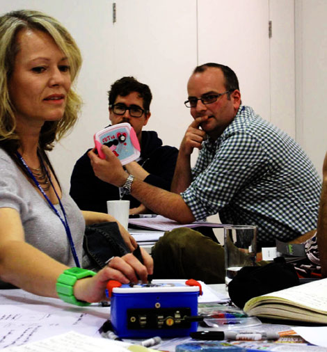
Photo by Sadhna Jain

Pingback: Code as control | Architectures | Dan Lockton