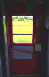
 British Rail’s drop-the-window- then-stick-your-hand-outside- to-use-the-handle doors puzzled over by Don Norman in The Design of Everyday Things are still very much around, though often refurbished and repainted as with this delightful/vile pink First Great Western-liveried example.
I’m assuming that this design was intended to introduce an extra step into the door-opening procedure, a speed-hump, if you like, to make it less likely that a door was opened accidentally while the train was in motion (before central door locking was introduced – which makes it less necessary). From a usability point of view, we might immediately dismiss any system which has to have such detailed instructions to inform the user about performing such a simple task, but it’s certainly interesting to consider this kind of poka-yoke. Being forced to lowering the window to get to the handle is almost like a modal ‘Are you sure you want to delete this file?’ dialogue box.

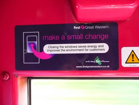
However, other concerns come into play and now need to be considered in addition: this sticker suggests keeping the window closed to cut drag and save fuel, but as I walked along the train, almost all these windows were dropped down, left in that position by the last person to close the door. The urgency of scrabbling to lower the window, stick your hand out and use the handle, with a crowd of commuters behind you probably overwrites any intentions to close the window again engendered by the ‘Make a small change’ sticker.


Pingback: Lean Solutions » Aprire il finestrino per aprire la porta