EDIT: I’ve now added the audio! Thanks everyone for the suggestions on how best to do it; the audio is hosted on this site rather than the Internet Archive as the buffering seemed to stall a bit too much. Let me know if you have any problems.
I’ve put my presentation from Persuasive 2008 on SlideShare, – because of the visual style it really needs to be listened to, or viewed alongside the text (below, or in the comments when viewing it on the SlideShare site). Alternatively, just download it [PPT, 11.6 Mb] – it comes with the notes.
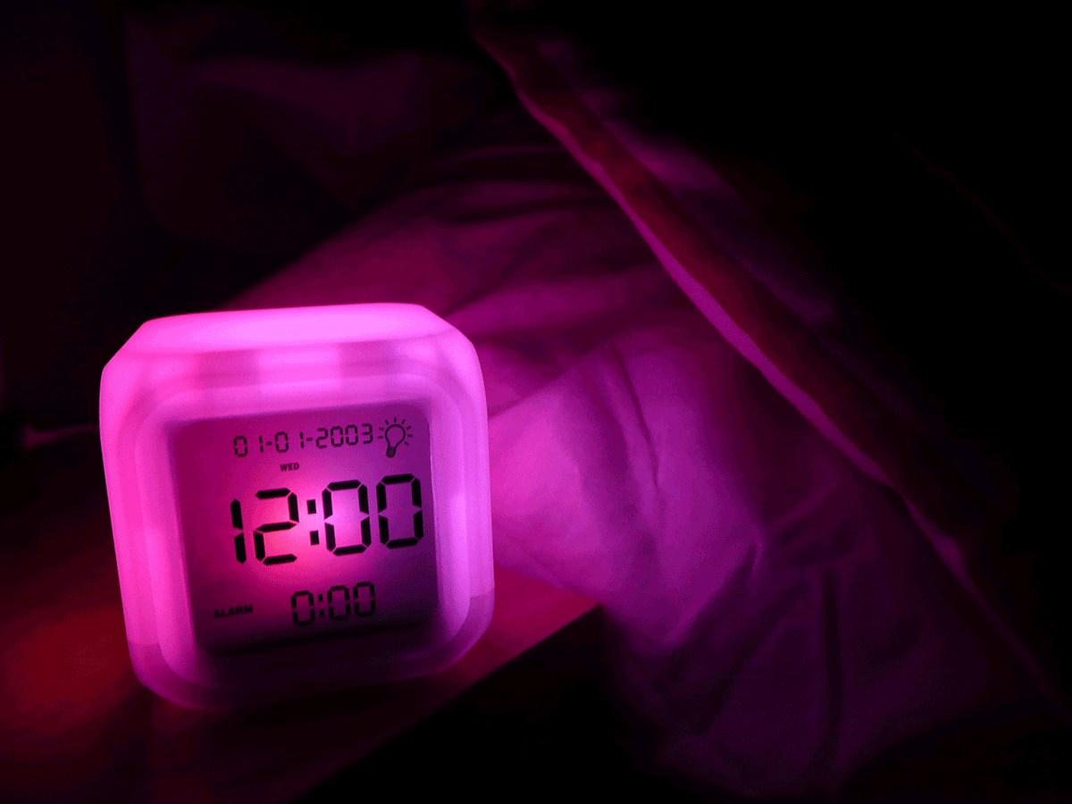
P.S. The slide about defaults, with the alarm clock stuck on 12:00, is meant to show it flashing – the actual PPT file uses an animated GIF – but SlideShare’s conversion process seems to have lost this element.*
1. I’m Dan Lockton, from Brunel University in London, and I’m going to be talking about what we call ‘Design with Intent’. It’s effectively Persuasive Technology in a Wider Context.
2. Persuasive Technology is an example of design that’s intended to result in certain user behaviour.
It’s design with intent.
3. If we cast our net a bit more widely, we can see that this idea recurs across many areas of design: solutions employed in one context are often applicable to others. Our research involves developing a tool to help designers match applicable design techniques to a range of ‘target behaviours’, and we’re ultimately going to be applying this to ecodesign, guiding more sustainable product use.
4. In this presentation we’ll look at a series of Design with Intent examples across different fields not normally considered part of Persuasive Technology, then see how the ideas of PT and DwI fit together. Then I’ll quickly describe how our work’s progressed since the paper was written.
5. Before getting started, have a look at these so-called ‘anti-loitering’ benches in Oxford, England — designed to prevent users actually sitting down, as the council freely admits. The seats are too high to sit properly and curved so you slide off if you try — you can ‘perch’, but that’s it. But there’s a worthwhile lesson right here: whatever the designers’ intent might be…
6. …people will find their own ways of using things. It’s easier to bend metal than to twist arms.
7. OK. In Human-Computer Interaction, as in Product Design, the main expressions of Design with Intent relate to designing specific affordances and constraints to guide users: shaping users’ perceptions of what actions are possible, and making some actions intentionally more difficult or impossible.
8. You can ‘design out’ affordances you don’t want the user to have — constraining the options available — here, to just ‘OK’, even if the user’s not OK with that – but it doesn’t always make for the best usability.
9. Or you can be a bit cleverer, and use a forcing function (a term coined by Donald Norman) — design the system so that the ‘right’ behaviour must occur before the user can take the next step. The example here is an interlock on a Toyota: to prevent the driver starting the car while it’s in gear, the ‘Start’ button is inoperative…
10. …unless the clutch pedal is held down…
11. …while the button’s pressed. I’ll admit it took me a while to figure that one out.
12. The best-known everyday safety interlock is on the microwave oven…
13. …where it will not operate unless the door is closed. Forcing functions generally aren’t subtle. They’re tending towards the coercive side of persuasion, but because they usually help us achieve something we want, such as keeping us safe, we don’t seem to mind too much.
14. Some affordance-manipulation can be a bit more subtly persuasive. Russell Beale, a computer scientist, used the term ‘Slanty Design’ to describe design which makes certain actions slightly more difficult, to discourage them. For example, these cigarette bins are sold on the basis that they have sloping tops not for aesthetic reasons, but so people don’t just leave cigarettes or litter on top of them.
15. Another aspect of affordance/constraint thinking is the persuasive power of defaults. We all know that many users leave settings exactly how they are, or simply choose the most prominent option: as designers, we can harness this power of choice architecture — as Richard Thaler and Cass Sunstein describe it – to persuade users into making the ‘right’ choices.
16. Imagine if all washing machines simply defaulted to the most efficient cycle (maybe even sensing the load to determine this). This is, again, subtle persuasion, but could have a big impact on users’ behaviour.
17. Now, in manufacturing, it’s crucial that assembly workers follow the right procedure when building something. To a large extent these are similar problems to those we’ve just seen — we want the ‘user’ (in this case that worker) to take certain actions, probably in a certain order. Every ‘mistake’ ends up costing the company money, in one way or another. Shigeo Shingo, a Japanese engineer, believed that with clever enough ‘defensive’ design, based on observation of workers, it was possible to eliminate assembly defects altogether. He called it Poka-yoke — mistake-proofing, and many of the ideas parallel those of affordances and constraints.
18. We’re used to seeing one of the very simplest poka-yoke methods every day — the ‘snipped’ corner on SIM cards, memory cards, and so, on…
19. …which prevent ‘assembly’ errors by ensuring that they can only be inserted into devices one way.
20. This is a control poka-yoke — it actually prevents the error from occurring. These are effectively forcing functions, as discussed earlier.
21. Shingo also used warning poka-yokes extensively, where a worker (or a user) is alerted to an error condition — something’s not in the right place, or is missing, or fitted incorrectly. The seatbelt warning light here indicates to the driver that a seatbelt is not buckled. This kind of immediate feedback on user behaviour is an example of suggestion-at-the-right-moment, or kairos, as defined in Persuasive Technology. It’s the right moment to warn the driver to fasten the seat belt.
22. Volvo for many years offered a gearchange suggestion light, which (based on monitoring engine RPM and throttle position), ‘suggested’ to the driver when he or she should change gear, to ensure the best economy. That’s a simple, clever persuasive technology: it makes ‘correct’ behaviour easier by guiding the user.
23. The idea that designers might ‘inscribe’ intended behaviours into artefacts has, in various forms, been subject to some philosophical and sociological debate. Johan Redström, developing an argument by Richard Buchanan, has suggested that since all artefacts are designed with some vision or intention of how they are ultimately to be used, it may be that all design is persuasive.
24. The presence of a chair persuades me to sit down where I might not have done otherwise. Designing the chair to appear more comfortable makes it even more likely. And so on.
25. Bruno Latour and Madeleine Akrich have discussed the idea that designers can ‘script’ behaviours into artefacts. Jaap Jelsma gives the example of a dual-button toilet flush as seen here, which effectively scripts users into making a decision about their water usage. There is no default, quite deliberately; the user must make some kind of decision.
26. This discussion has many expressions in urban planning, in fact: how much does architecture control us? Langdon Winner asked ‘Do artefacts have politics?’
27. His most famous examples were these very low overpasses built over a number of parkways on Long Island, by Robert Moses — too low for buses to pass underneath, with the effect of making it more difficult for poorer people to visit the Jones Beach State Park.
28. But there’s always the danger in this area of ascribing to malice what might more reasonably be explained by other factors, and the use of Moses’ bridges as the eminent ‘artefacts with politics’ example has been challenged in recent years by a number of authors.
29. Nevertheless, it is clear that some artefacts do have politics. We saw those perch benches in Oxford earlier on. Now, rough sleeping, by the homeless or otherwise, is frowned upon by many public authorities.
30. Sometimes benches with central armrests are installed specifically to attempt to stop this behaviour, especially at airports and railway stations.
31. Some models of bench are even sold to authorities on the basis that they will ‘discourage overnight stays’.
32. Not that some users can’t find a way round this…
33. Not all such techniques are so ‘anti-user’. Spaces and seating arrangements can be designed to be sociopetal, that is, to persuade people to interact — the simplest technique is to face seats towards each other…
34. …it doesn’t always work, of course.
35. Transposing the ‘architectures of control’ concept to the digital world, Lawrence Lessig used the phrase “Code is law” to explain how the structure of the internet, and what actions are possible, effectively regulates and shapes behaviour online, regardless of what laws may actually apply. If the system makes it easy to copy music, it will happen. Simplicity is persuasive.
36. So-called technological protection measures such as digital rights management — DRM – can be seen as attempts by companies to lock down the freedom of behaviour afforded by the internet, and persuade consumers into adhering to specific business models drawn up in an offline world.
37. Some of the most prevalent efforts at designing persuasion are for purely commercial benefit. Aside from advertising itself…
38. …there are strategies such as the razor-blade model, where a product is designed to persuade the consumer into repeat purchases of consumables, by locking him or her into a particular format. Electronic authentication makes this easier to enforce: for example, some printers include a ‘handshake’ which ensures that only the original manufacturer’s (usually higher-priced) cartridges can be used. Such strategies tend towards the coercive side of persuasion.
39. So, that was a very quick run-through of examples and ideas from a range of disciplines. I hope you can see how the Design with Intent idea runs through it all. But how does the field of Persuasive Technology, as it is defined, fit with this? Much PT research focuses on persuasion with intended social benefit — such as improving health – but much persuasion in the world as a whole is about intended commercial benefit. These don’t have to be mutually exclusive, of course: a fitness equipment manufacturer or a gym persuading people to exercise fulfils both social and commercial benefit intentions.
40. So, it makes sense to think of these as two separate dimensions of the ‘Design with Intent’ space.
Another aspect is whether the impact on the immediate user is helpful or not. This is where some persuasion techniques may fall down: it might be better for society, in terms of energy saving, if you can’t put your TV on standby any more, but it’s likely to inconvenience you. This is the grey area above. So if this space represents all Design with Intent, then maybe PT, as it’s defined, is the area outlined with the dashed line: it’s centred on intended social benefit, usually (but not always) helpful to the immediate user, and possibly with intended commercial benefit too. Still, this is only one way of visualising the relationship: as the boundaries of Persuasive Technology as a field are debated and redrawn, we may find that visualisations illustrating other aspects, such as coercion vs. persuasion, and so on, become useful.
41. Going beyond what’s in the paper now, over the last few months we’ve considered and analysed many different examples from different fields, and have tried to classify these techniques to understand them better and synthesize similar ideas.
42. The techniques pretty much fall into five ‘approaches’ which, though always open to debate, are useful in defining the mind-set a designer might have in approaching the problem.
43. These techniques have then been incorporated into a ‘suggestion tool’, which, given a target behaviour, allows designers to explore applicable techniques.
44. …The target behaviours are abstract descriptions, but can be applied to many different problems; each breaks down further into more specific target behaviours.
45. The next stage of our research will be testing out this suggestion tool, both in practical workshop sessions with design students and then with design consultancies… and with an online version, too.
After that, the aim is to do user trials with prototype ‘persuasive’ products developed as a result of applying the suggestion tool to sustainable behaviour problems, comparing how well different techniques actually work in practice in terms of changing behaviour, saving energy or reducing waste.
46. To conclude, I hope this brief review of Design with Intent has been interesting, and more importantly, inspirational in terms of suggesting examples of behaviour-shaping design beyond the immediate Persuasive Technology field. Our research is only at a very early stage, but we hope in due course to be able to present some concrete results, applying ‘Design with Intent’ thinking to guiding user behaviour, specifically in sustainable design.
47. In the meantime, if you’re interested, please do have a look at the research blog — at danlockton.co.uk. Thanks for listening.
All photographs/images by Dan Lockton except:
Slide 6 — Oxford Cornmarket bench with teenagers — Stephanie Jenkins –
http://www.headington.org.uk/oxon/cornmarket/new_seat.htm
Slide 14 — two catalogue images — New Pig Corporation –
http://www.newpig.com
Slide 22 — Volvo 340/360 dashboard — Volvo 300 Mania forums –
http://www.volvo300mania.com/
Slide 27 — Wantagh Parkway overpass — Peacenic on Flickr –
http://www.flickr.com/photos/68841932@N00/73241931
Slide 28 — Jones Beach approach — New York Architecture –
http://www.nyc-architecture.com/BKN/BKN001.htm
Slide 29 — Sleeping on a Hyde Park Bench — David Basanta on Flickr –
http://www.flickr.com/photos/dbasanta/2093742562
Slide 31 — Georgetown bench — Belson Outdoors –
http://web.archive.org/web/20040417173248/http://www.belson.com/gbrec.htm
Slide 32 — ‘Happy homeless’ — Rick Abbott on Flickr –
http://www.flickr.com/photos/rickabbott/81779858
This presentation was given by Dan Lockton at Persuasive 2008, Oulu, Finland on 6 June 2008, based on the paper: Lockton, D, Harrison, D. and Stanton, N.: Design with intent: Persuasive technology in a wider context, in H. Oinas-Kukkonen et al. (eds.): Persuasive 2008, LNCS 5033. Berlin Heidelberg: Springer-Verlag, 2008. pp. 274 — 278.
A preprint version is available free from http://hdl.handle.net/2438/2138
*The clock is a Mayhem Aurora, designed by Rob Leeks and Matt Chapman, and in reality does not flash when the time isn’t set. But I didn’t have a VCR handy to photograph…
Pingback: Design with Intent – A blog on design that influences behaviour « REBAR