UPDATE: The code being used is from the Explorer Destroyer project, which has an explanation of its rationale here. It’s worth noting that it’s not just ‘Get Firefox’, but ‘Get Firefox with the Google Toolbar’, hence the $1 referral fee… I’d much rather have Firefox with some degree of privacy, to be honest. Thanks for the info, Joshua.
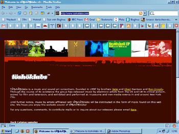
This is what Töshöklabs’ website looks like in Firefox:
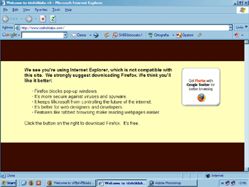
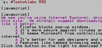
And this is what it looks like in Internet Explorer (with a close-up of the text):

I came across this site via an interesting piece at 3.7 crea.tv:
“While I understand the frustration many designers have when dealing with making a site IE compatible, and I absolutely love the idea of more users browsing with Firefox, we have an obligation to make sure the IE version of a site looks just as good as its Gecko counterpart. It is, after all, the most common browser in use hands down… It wasn’t until I saw this “IE incompatible site” that I realized how bad this trend has spread… The designers outright do not let you browse their site if you are on IE. They shut out 80% of the Internet without batting an eye. This is no different than the painful old trend of stating how the web page should be viewed, IE: “Best viewed in 800×600 on IE 3.2″.”
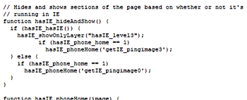
The thing is, the Töshöklabs site is not actually ‘IE incompatible’ at all. The site is deliberately made unusable in IE by showing a hidden layer, invisible to Firefox (and Opera) users:
This is a clever trick; I’m not quite sure what my reaction should be. Are the site’s creators saying “IE users aren’t the sort of people we want using our site”, or just “Get educated“? It’s surely the latter, but they perhaps forget that many possible visitors are stuck in offices where they’re just not permitted to install Firefox (or other alternatives), or are using other types of specialised browsers*, screen-readers, etc. Not everyone is able to make a choice about the software he or she uses.
I understand exactly what Töshöklabs are trying to do, and the aim of spreading the message of alternative software is a laudable one (as is their giving away DRM-free music), but the implementation is only one step away from MSN’s deliberate anti-Opera behaviour. It would be better from a usability point of view to have that “We see you’re using Internet Explorer…” message as part of the homepage, large enough to catch visitors’ attention but not take control away from them.
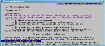
*e.g. here’s what it looks like in Lynx – not a very intelligent script, then!

5 Comments