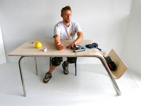
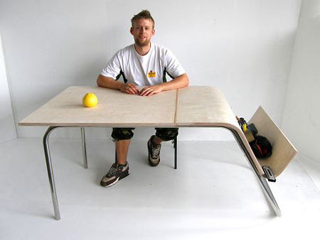
Above & below: ‘Push’ Table by Jennifer Hing.
Jane Fulton Suri‘s wonderful Thoughtless Acts? chronicles, visually, “those intuitive ways we adapt, exploit, and react to things in our environment; things we do without really thinking” – effectively, examples of valid affordances perceived by users, which were not designed intentionally.
Observing how people actually ‘make use’ of/hack the products, systems and environments around them – emergent user behaviour – and extracting lessons and ideas which can then be applied developing new and improved products, is a cornerstone of IDEO’s human factors strategy, and it seems to have been very successful. It’s an intelligent way of designing.
So I was excited to see, at New Designers last week, some inspired projects based around exactly this kind of thinking.
Jennifer Hing (Manchester Metropolitan, Three Dimensional Design) has dedicated her work to just this principle (as she puts it, “I design around people’s natural behaviour, bending objects around the fine details of living”) with a pair of beautifully simple, efficient pieces of furniture, the ‘Push’ Table and Hallway Stand, both of which intentionally afford users what they’d like to do anyway, at just the right moment:
Clearing the table is a simple task made complicated by the search for an alternative surface to temporarily relocate anything removed. An easy and desirable solution is to push everything off the surface and out the way, yet this movement is contrary to what culture, experience and common sense has taught us.
This table is based around the ‘pushing’ action. The sloped surface gently catches falling items, containing them until next required. It allows the most basic and initial response to clearing the table to take place.
As someone whose filing system consists mostly of using every horizontal surface I can find to deposit strata of tools, books, papers, components, etc, the utility of the Push Table resonates very much. I can even imagine building (adjustable) separators into the sloped section, to allow a primitive physical filing system to emerge (but see also Anna Harris’s Ifiltro, discussed below).
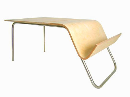
Above: ‘Push’ Table; Below: Hallway Stand by Jennifer Hing.
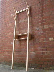
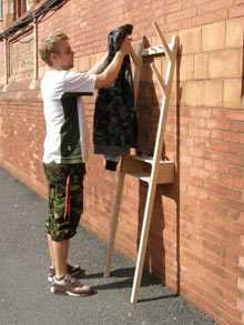
The hallway… holds strong routines in preparation for departure, individual to everyone. It can range from busy and hectic to quiet and empty within seconds, it experiences different weights of traffic depending on the time of day and is the instant dumping ground for anything that may arrive through the front door. It is an intense yet brief environment… The Hallway Stand is the amalgamated solution to many of the little actions and issues we have in that particular environment. It provides one collected place for coats, shoes, bags, keys, post and anything else we allow to loiter there. The aim is to simplify and contain this highly functional area.
It’s angled so it can be leant against any wall, with the shelf/drawer/oddment tray horizontal, and has an array of peg-type hooks that by the look of it could be used for lots of different things. Again, almost inviting emergent behaviour. Jennifer’s personal statement is also, very rarely for a new graduate designer, clear and eloquent about what she wants to do: “I want to make better use of and develop people’s initiative alongside bringing ease and fluidity to everyday actions.” I wish her the best of luck: this approach to design really is an open door waiting to be pushed, if only you can find where to push.
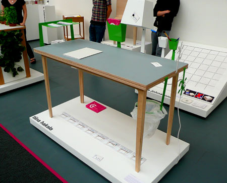
Above & below: My Table by Tiina Hakala
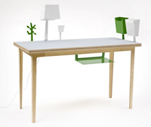
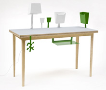
Tiina Hakala‘s My Table embodies some similar thinking (as does her Stor chair):
This project started as a research how people misuse items, for example how we often sit on tables or hang our clothes on door handles. This ‘unintentional design’ worked as an inspiration for My Table. We often use our desks for something totally different than working… I tried to keep this in mind and find a storing solution for the endless items, lamps, pens, paper folders, etc, we keep on our desks.
My Table offers endless possibilities to customize your workspace. The re-configurable sheet metal parts slide between two tabletops that allow you to move them around and organize them in an order that fits perfectly for you.
Again, this is a clever and neat approach – the variety of parts reminded me of the kinds of add-on bins, brackets and workpiece holders often found around machine tools where experienced machinists have adapted their environment to match their workflow. (Looking in detail at how other people set up their workshops/studios/desktops (in all senses) is endlessly fascinating.) Tiina’s system uses a table top with a slot all the way round to hold the tab on the add-on parts, but a system with adjustable clamps (sprung or threaded) could also work very well, if perhaps not as elegantly.
In addition to the utility value, there’s also the ‘personalisation’ benefit, as Tiina (UCCA Rochester, Furniture & Product Design) mentions on her website: arranging these holders, lamps, bins, hooks and so on does allow a workspace to match the user’s mental model much more closely, while displaying some personality. (Still, I’ve held by the “messy desk a sign of a sophisticated mind” philosophy ever since seeing a newspaper article with that title stuck to the underside of another kid’s desk lid at the age of 8 or 9.)
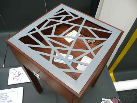
Above & below: Ifiltro table by Anna Harris
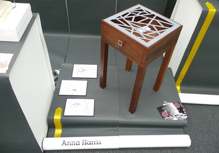
The Ifiltro table, by Anna Harris, is very clever indeed. As the accompanying cards explained:
Remove items from your pockets – Drop or place the contents onto the Ifiltro table top – Small items such as keys and money will filter through to a drawer below.
I don’t know if Anna’s thinking was along the same lines as Jennifer and Tiina’s, but the design’s addressing a very similar area, and it’s something that’s simple and, fundamentally, elegant.
It reminds me of an example I saw in a (GCSE?) design & technology textbook, where a student’s design for a ‘machine to sort two different sizes of marbles’ (a brief which may conjure up images of sensors, comparators, gates, etc) was simply two diverging steel rails made out of coat hangers, with two trays underneath, so that as they rolled along the rails, smaller marbles dropped into the first tray and larger marbles into the second. We don’t see that sort of design thinking often enough – I guess it’s a kind of analogue computing (I know I’ve gone on about it before).
What do all these projects have in common? They’re fundamentally about matching the product’s affordances to what the user would like to be able to do in a situation, based on observations of users’ behaviour and unintended perceived affordances found in artefacts. That’s quite a mouthful. We could call it designing for behaviour, maybe. It’s design to match behaviour rather than design to cause behaviour (which is most of what I talk about on this site).
But then, the affordance of, say, the sloping section on Jennifer’s table, means that a user will perceive it and be more likely (probably) to use it, than sweep stuff onto the floor. So it does ’cause’ user behaviour, in a way, as does all design.
I’ll come back to this idea, as once we start looking at products with more technological content, it perhaps becomes easier to distinguish the ideas of ‘product behaviour’, ‘user behaviour’ and ‘overall behaviour’ (an idea I’m grateful to Ed Elias for).

Pingback: Ponoko Blog
Pingback: Monkey Plunger » Blog Archive » Thoughtful Acts