A few days ago, Tim Quinn of Dangerous Curve posted an interesting observation on the Simple Control in Products page:
“This may not be what you had in mind, but I immediately thought of such things as toothpaste pumps that ‘meter’ use to insure the product will be used up quickly at a rate higher than needed. That made me think of the older method of training consumers to over-use. Typified, once again, by toothpaste, with ads which show a brush topped by a generous glop of paste that is far more than necessary to do the job. This strays a bit more from your topic but it could fall under the design for control heading.”
This is definitely a phenomenon worth exploring further, since it’s part of our everyday experience, right under our noses, yet we may not be conscious of it. It’s at the intersection of advertising, marketing and product design, with particular applicability to fast-moving consumer goods. There are some parallels with the Retail Tricks to Make You Shop noted by Space Hijackers, and in the technology field, the manufacturers of printer cartridges have long practised it, whether through technical measures or more subtly (e.g. the Hewlett-Packard MOPyFish).
But the design of product packaging can definitely exhibit architectures of control – forcing functions – in a way reminiscent of Vance Packard’s Hidden Persuaders, taking forcing functions beyond the benign health & safety intentions outlined by Don Norman, to a purely commercially driven design which actually disadvantages the consumer.
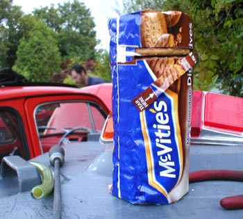
I haven’t yet had a chance to examine the toothpaste pumps which Tim mentions above, but the example which sprang immediately to my mind was the use of ‘Tear Here’ tabs on packets of biscuits (cookies). Look at the pictures of a packet of McVitie’s Chocolate Digestives:


That ‘Tear Here’ strip is positioned 4 biscuits down the pack. If you do tear there, as illustrated above, you expose 4 biscuits. Those 4 biscuits aren’t packaged any more. You can’t put them back in the pack; that bit of the wrapper is no longer usable. The biscuits go soft within a few hours when exposed to air. You just have to eat them. And, in fact, probably the next one down, too, to allow the remaining bit of wrapper to be crumpled in to cover the rest of the stack.
So that’s 5 biscuits you’re cajoled into consuming (or at least, given an inconvenience incentive not to consume), just for having opened the pack the ‘recommended’ way. Each biscuit gives you 87 calories and 4 grammes of fat. That’s approaching an ounce of fat if you eat 5 in one go.
Shapes of packaging, too, can be designed to increase consumption of the product – sometimes by dispensing more than is really required, as in Tim’s toothpaste example, but also by making it difficult to reach the last bits of whatever substance is in the packet or container. We’re all familiar with trying to get the last spread out of an oddly shaped jar with a knife or spoon, though whether this is a deliberate architecture of control designed in by the manufacturers is difficult to know. They still have to make the stuff, whether it’s wasted or not; but they do end up selling more jars if no-one can get to the last 10% of what’s in there.
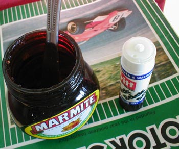
In the picture below (just two immediate examples of ‘stuff left in packaging that’s difficult to get out’ that were lying around my desk), the Marmite jar shape is traditional (and hence probably not a cynical modern design move) while the last bit of glue in the Pritt Stick, which is below the plastic rim and so can no longer be spread, is actually structural (it is the encased end of the glue stick, which is effectively cantilevered). So I think it’d be stretching the point too much to class these as architectures of control (there is no intention to control the user’s behaviour); nevertheless, they are inconveniences for the user.

(In fact, in Marmite’s case, the difficulty in getting the last bit out of the jar has been played on very effectively by the ad agency DDB London in a very clever campaign (worth watching the Quicktime links) for a new ‘Squeezy’ plastic jar ostensibly intended to alleviate the problem (but also reducing packaging costs, and giving 50 grammes less Marmite for the same price). I’m sure the ability to mock – and point out the problems with – the product in this way also says a lot of interesting things about Marmite’s strength and proposition as a brand.)
Back to the main point, then, it’s clear that there are a few ways that consumption of a product can be ‘encouraged’, and to some extent, controlled, by the design of the packaging. This certain qualifies the phenomenon as a an architecture of control, and while on the face of it, a packet of biscuits may not seem to have much in common with digital rights management, ‘trusted’ computing, or urban planning, the intentions behind the way these products and systems are designed have much in common. They are all about shaping users’ behaviour, for political or commercial ends.
We might also think about using the same ideas the other way round. If it were made difficult to eat more than one biscuit at a time, then that might help promote a ‘healthy eating’ intention. If cup-holders in cars were made smaller diameter, so that only smaller soft drink cups would fit, would that make it slightly less convenient to buy a larger soft drink at the drive-through? Would that inconvenience have an effect on people’s behaviour? (I have quite a few more ideas in this vein, but I’ll save them for another day).
Finally, it’s worth considering that the concept of planned obsolescence (or built-in obsolescence) has a good deal in common with ‘excessive consumption’ forcing functions, especially when products ‘expire’ on a certain date or after a certain amount of time. Sometimes the expiry is merely the date printed on the packaging, which is enough to make consumers throw away food or medicines which may still be usable, but in other cases a technological measure is used to expire the items – whether they’re ink cartridges, eBooks, DVDs, ringtones or data across a network. Again, designed-in-obsolescence also has the possibility to be used for more socially beneficial reasons, as I suggested in Optimum Lifetime Products, though as far as I know there are no real-life examples of this at present.
Please do comment: any examples of forcing functions (sneaky or otherwise) designed into packaging, or other products, with the intention of increasing (or reducing) the consumption of the sustance, would be much appreciated. I’ll try to post more as I come across them in the future.

Pingback: Architectures of Control in Design » Embedding control in society: the end of freedom
Pingback: Tearstrip-tease at fulminate // Architectures of Control